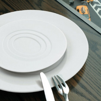
Thomas Keller. Among all the celebrity chefs, he is known as the ultimate perfectionist: The best ingredients. Flawless technique. Perfect finish. This is probably why he has won numerous James Beard awards and is the only American chef with two top-rated Michelin 3-star restaurants: The French Laundry in Napa Valley, which revolutionized fine dining, and Per Se in New York, which took it to a new level.
The secret of his success, though, is not just great cooking. Keller also knows how to make his culinary creations look like art. He’s such an expert on presenting food, he even designed his own Limoges porcelain dinnerware.
After some studying, we uncovered some of his secrets for showcasing food as art. Whether you’re a star chef or rely on uberEats, we hope these techniques will take your meals to new levels of sophistication:
1. Make It a Hero
A museum shows each work of art separately, with plenty of space in between to give you time to pause and absorb what you’ve seen. Similarly, you should do this for your food: Break up a meal into its courses and each course into its components. Highlighting each component, with room in between, turns the humblest side dish into a hero:
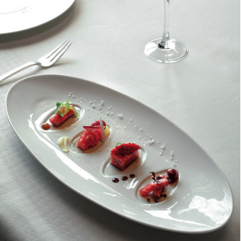
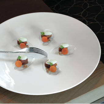
2. Frame Your Courses
Every course you serve should be properly framed, just like fine art. And just like art, the plates that frame your food could either complement it or contrast it for greater focus.
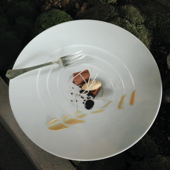
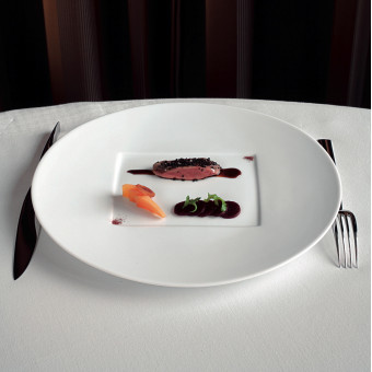
3. Create a Focal Point
To create a sense of drama, use special dishes that draw the eye to the food being served.
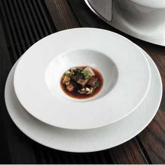
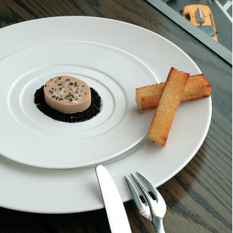
4. Follow the Food’s Natural Shapes
Some foods already have strong shapes — a square or oval slice of cake, a round souffle, or an oval quenelle dumpling. In those cases, naturally follow the shape of the food you’re serving.

5. Create Subtle Contrasts
Some foods, like risotto, do not naturally have any form or shape. For dishes like that, Keller designed a complementary Checks pattern dinnerware with a subtle checked pattern. This adds contrasts and interest to the course, without overwhelming it with strong colors or patterns.
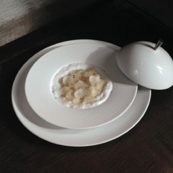
6. Use Geometric Shapes to add Contrast
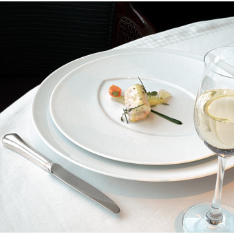
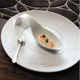
Another way to highlight a course is to use interesting and unexpected geometric shapes, like in these examples:
7. Create a Sense of Rhythm
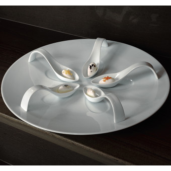
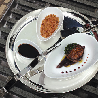
Set items one after the other, in a regular space and with similar pieces or sizes, to create a sense of rhythm as the person experiences each part of the meal.
8. Unify with a Color Scheme
Every museum or gallery exhibit has a deliberately chosen wall color to tie it all together. When there are many different color or patterns, white is usually the unifying color. This is exactly what Thomas Keller has done so well. His pure white Limoges porcelain dishes bring together an entire meal, from dark colored soups to brightly colored meats and vegetables to ivory and cream risottos and desserts. They are all celebrated like works of art.
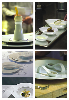
Bringing it all together…
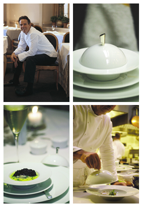
…just like a Master Chef!
Shop Thomas Keller Dinnerware

