My “Theory of Design”
One of the tricks to successful designs – whether you are thinking about stationery, a restaurant, or a home – is the presence of a common thread in the realization of an idea. Think about your favorite stores – two of ours are Restoration Hardware and Williams-Sonoma Home – or your favorite movies (“Something’s Gotta Give”). Within each one, isn’t there always a common theme that carries the message from beginning to end?
At Restoration, for example, the paint colors work with the linens and the bath towels, and the look of the products is consistent within each collection. The same thing is true with movies. In “Something’s Gotta Give,” it’s obvious that set decorator Beth Rubino (by the way, The Skirted Roundtable did a great interview with her) had very specific ideas for how the character of the house would be presented on film: a shingled house, simple rugs, white slipcovers, a slightly dented refrigerator door … in short, a metaphor for the busy, successful (yet human) character played by Diane Keaton. This is how the pros do it, and it’s because it’s the most comforting and practical way to design for the long term. So as you design your spaces, take some time to think about the big ideas: this way, everything you gather will end up going with everything else, rather than “Well, this looked great at the store but somehow I can’t make it work here.”
But here’s one caveat: the idea is to have things work with each other, rather than to match completely. The best designs are those that work individually, and then as a whole. Certain designs, for example, work better in large expanses (like wallpaper or curtains) than they do on small pieces (like napkins). Case in point: utilitarian items are most soothing when they are easily recognizable. This is why most tubs are a creamy white rather than designed to match our toile shades.
Trina Turk’s Table Linens: An Example
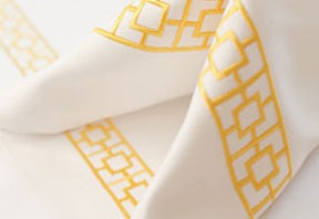
As an example, take a look at the new collections of table linens designed by Trina Turk. Although she is known for her bold, graphic designs (which we think work well on pillows and rugs), we really appreciated that she took the time to scale them back for the table. The fact is that the best designs for the table are simple. There is something soothing and very clean about a white napkin that just doesn’t come across with a busy pattern. So kudos to Trina for coming up with a collection that complements – rather than copies – her other items for the home, and that is just right for the table.
Here are the collections; all embroidered on 100% cotton and completely machine washable. Every piece is under $30 each.
The Palm Springs is a new classic; available in yellow or black:

Oval Sun is a retro motif in orange or turquoise:

And Tiki is great in green or turquoise.

Have fun in the sun!
Gracious Style is an online retailer of sophisticated, high-quality products for every room in the house. We love helping others create warm and welcoming rooms for themselves. To read more, visit our blog.

Comments
One response to “Complete the Look: Clean and Simple Table Linens by Trina Turk”
Thanks for the mention and link to The Skirted Roundtable. We had a lot of fun chatting with Beth Rubino and learned so much from her!