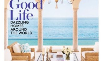
Is there a defining design style today? The latest AD cover actually sums it up:

Look carefully, and you’ll notice a traditional chandelier:

On top of a very sleek, modern coffee table:

You see small bursts of exoticism and color, but the primary design is neutral and comfortable

Lest you take this for granted, take a look at what was on the cover of AD in 1970:

and 1971:

Back then, we had sharply divided design styles. You were either a Traditionalist or Modernist, and there was no mixing of the two styles. Neither style seemed very comfortable either — could you imagine hopping onto either silk or leather couch on these covers?
In contrast, today’s design has finally balanced both traditional and modern elements and made it all the more comfortable.

