Save to...
Punk, Studs, and Color: Waterford’s New Rebel Collection
Every once in a while, a collection comes along that just knocks it out of the park. Jo Sampson, the British designer responsible for developing some of the most iconic interiors in the world (for Hermes, Fairmont hotels, and Four Seasons hotels), was recently tapped by Waterford to create a fresh new line of barware and home accessories. And the results are stunning!

Spring Rug Sale – 20% Off Company C Rugs
Just in time to get your home ready for Spring, you can get 20% off all Company C rugs with coupon code CORUG20.
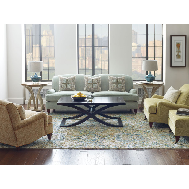
Since 1994, husband and wife team Walter and Chris Chapin have been creating handcrafted, colorful rugs that draw on nature, antique textiles, and playful motifs for inspiration. From now until March 7, you can get 20% off Company C rugs and freshen up your home. Plus, get free shipping on any order over $75.
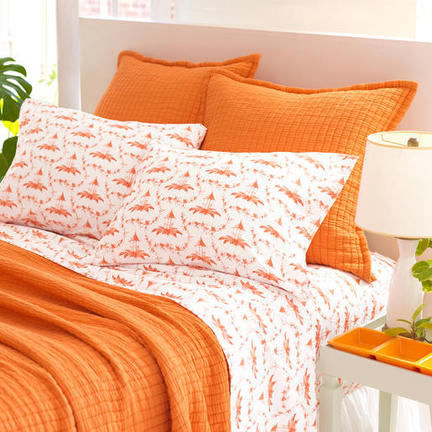
Just $15: Pretty in Plaid Flatware from David Stark and Martha Stewart
Cold weather might bring back plaid and tartans, but they don’t have to make your home look like those oversized lumberjack shirts in the back of the closet. In fact, plaids are a great way to mix things up and introduce different colors. Says renowned NY event producer David Stark in his recent Pretty in Plaid feature for Martha Stewart:
If you’re the type of person that wants things to look cohesive, but not too matchy-matchy, try mixing different colors of the same plaid. For color mixing, pick a particular color that each plaid will have in common. For example, if each pattern contains a vibrant cherry red, it will keep your look together. These flatware sets all have the same base color — a neutral white — so they can be mixed and matched on your dinner table.
And here are the plaids he chose, in London Chic chocolate red, London Chic cucumber green, and London Chic denim blue:

And the best part? The stainless steel flatware has ABS plastic handles which are dishwasher safe and treated with Xtra Wash, a unique technology that keeps colors looking like new after hundreds of washes. These are an absolute steal at only $15 per 5-pc setting!
We still remember watching the Martha Stewart TV shows years ago, so it’s a real treat to be featured in her blog now. Thanks for thinking of us, David and Martha!
The Architecture of Light at The Broad Museum in Los Angeles
How would you display one of the most coveted contemporary art collections of our time?
Eli and Edythe Broad, by now L.A.’s most famous art collectors, were so particular about how their art was to be displayed, they actually turned down just about every museum in town and commissioned their own $140-million museum by Diller Scofidio + Renfro:

When we visited The Broad last weekend, we realized that part of the reason might be how to display the art in the proper light.
Art is usually kept away from direct sun light to prevent damage. Eli Broad knows this well: he once kept a van Gogh in a desk drawer so it wouldn’t get sun damaged. But art shown under artificial light just looks different. So The Broad employs a special architectural detail to show its art under perpetual indirect natural light.
Each of the openings in the ceiling and on the side of the museum, dubbed the “veil” by the architects, functions as a light cell, bringing in a small amount of natural light and casting it on a concrete surface:

The light from many such small concrete surfaces then add up to a bright but indirect light for the interior, dubbed the “vault”:

On the side of the museum, the light cells bring in the outdoor light with just glimpses of the outside world, instead of creating distractions to compete with the art:

Seen from the outside, the museum may look like a bold gesture for the revitalization of downtown Los Angeles, especially next to the Walt Disney Concert Hall:

But in fact, it is actually a perfected machine for showcasing art in the best light, thus fulfilling the Modernist creed of “Form Follows Function” to a T.

Have any of you been to The Broad? If so, we’d love to hear what you thought! If not, get free tickets to The Broad by clicking here.
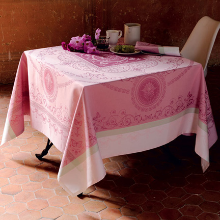
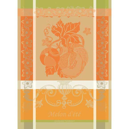
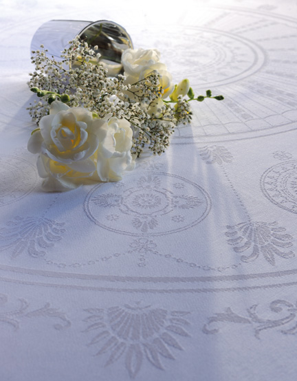
All Garnier-Thiebaut French Linens on Sale 20% Off!
Great news! From now until the end of June, all Garnier-Thiebaut table linens and kitchen towels are on sale for 20% off. Plus, you get free shipping on all orders over $75.
The linens from this well-known French company have been used by the Four Seasons George V in Paris, the Mandarin Oriental Hotel in Geneva, Le Meridien Bora Bora, and The French Laundry restaurant in Yountville. Their designs range from classic neutral tablecloths to vividly bright jacquard table runners and wonderful kitchen towels.
Plus, their easy care collection is stain-repellant, so you can wipe away all spills for easy summer entertaining. To read more about the company’s Green Sweet easy care collection, click here.
Here are a few of our favorite collections:
|
|
|
|

To view our full Garnier Thiebaut section, click here!
Traveling with the Next Generation: How to Get the Look at Home
Isn’t it extraordinary when you walk into a hotel that’s so well designed it feels like it was created just for you? Or when you know instinctively where you need to check-in, or where you could meet friends for a drink after work? And then, as you walk around, you realize that other people are having the same experience, but they’re speaking Russian?
It’s really hard work to get all those details right, and for them to make sense for very different people from all over the world. But that’s good design.
Years ago, I read a book by Isadore Sharp, founder of the Four Seasons Hotels. And in it he talked about some of the changes he’d pioneered over the years that little by little had created the behemoth it is today.
For example, did you know that he introduced the practice of giving each guest toiletries like shampoo and conditioner (and not just soap)? Twenty-four hour room service (practically a necessity after those late flights)? Or twice-daily housekeeping service? Seems like a small thing, but isn’t it nice to come back to your room after dinner and see that the mess you left behind has all been picked up?
Little by little, each of these innovations have changed how we interact with hotels. They’re now more than just places to sleep; the best ones deliver full-on experiences ranging from a local weekend away from home to full-on trips with the family to finding a way to connect with a new city while you’re in town for your college buddy’s wedding.
So I was really interested when I saw an article in the New York Times (“Hotels for the Next Generation“) that talked about the newest brand extensions from some of the largest hotel brands in the world: Marriott, Hilton, and Hyatt.
Were the innovations in these brands significant? And if so, how could we adapt these ideas at home?
Here’s what I learned. The new brands are aimed at the Millenial generation (aged between 18-34 in 2015) and at cosmopolitan travelers looking for affordable, modern spaces with a bit of personality.
Moxy (from parent Marriott) is creating spaces for younger travelers who are very connected in social media and enjoy sharing spaces for work and fun. For these people, free wi-fi is a must, along with open areas (like those featured in our “Billion Dollar Startup” blog) that allow them to connect with other people. There’s also a 24-hour self-service coffee bar.
Get the look: Here in Los Angeles, all the new high-end houses have this: large kitchens connected to large family rooms, with disappearing glass doors that fully open onto a huge deck. So this way, parents can keep an eye on their kids, while guests can feel free to pitch in to help. Need a cup of coffee? Make yourself at home; our state-of-the art coffee machine is right there in the corner, and milk and cream are the fridge underneath. Or help yourself to a beer; it’s all there for you. Make it easy and fun for everyone to feel at home.


|
|
|


AC (also from Marriott) is designed for some of the same people, but these folks are much more design-centric. The look is very cool: modern, with warm touches of wood, extraordinary lighting, and interesting pieces of art throughout. This is for the guy who no longer walks around in his college duds; he’s the young agent who’s got his eyes on a pair of Pradas and knows what a Tom Ford suit looks like. For these, it’s all about clean lines: sofas in neutral colors, curated objects that are arranged just so; high-tech the whole way. These places are usually very clean and relaxing.
Get the look: Clean lines and neutral colors are sophisticated and calming. Try organizing your closet so that all your clothes and shoes are color coordinated. Swap out your bath accessories for ones in cool shades of white and gray. Introduce a sense of calm by turning off your cell phone, dimming the lights in your dining room, setting the table, and sitting down to dinner with your family.


|
|
|
From Hilton, there’s a new brand called Canopy. As the name implies, this is all about a place that wants to take care of you. In their introduction to the brand, they have a group of cool people drawing out their ideas for a hotel on a blackboard. So the result is a place that works just for you. If you’re in Denver, you might find snacks from the Rocky Mountain Chocolate Factory as a welcome treat. In the evening, there are complimentary beer tastings, and in the morning, you can have free breakfast at the hotel or on the go.
Get the look: How would this work at home? Start by asking your family members what they need to be happy at home. Then think about how you can connect more with where you live. Can you give a chance to your neighborhood trattoria, so that when your sister comes to visit from out of town, you can take her to a place she won’t find anywhere else? What kind of stories are there for you to pick up? The finance guy who’s now making wood bowls out of his garage? And he’s really good at it, so you’ve brought a few home?


|
|
|
Do you have any ideas to share about how hotels have influenced what you do at home? If so, please share it in your comments.
Obsessed with Copper: 14 Ways to Use The Gorgeous New Metal
I’m obsessed with copper. Sometimes, when you’re putting a room together, nickel is too bright while brass seems too shiny. In those cases, copper strikes just the perfect balance between something that looks aged but can still bring the room alive.
Here are some amazing ways to use copper in your home:


Inspired? You’re welcome.

Check out more ways to use copper by following our Pinterest Copper Accents page.
How to Choose the Right Rug for Every Room in your House
When choosing a rug, always start by thinking about you’ll be doing in the room. Typically, it comes down to three functions:
1) Entryways, bathrooms, kitchens, laundry rooms and mud rooms: easy to clean rugs
2) Family rooms, offices, closets: casual and lightweight rugs
3) Living rooms, bedrooms: thick and plush rugs
After you’ve narrowed it down to which kind of rug you need, here are a few things to consider:
Entryways/Foyers
– In the entryway, choose a rug that hides dirt well and is large enough to cover the width of your door.
– Measure your door clearance so that the rug is not so thick that it gets in the way when you open and close your door.
– In the foyer, rugs can be used to anchor a console table, direct your sight lines forward, or add color. For best effect, leave at least 6-12″ of bare wood exposed on all sides.

Living Rooms
– The best rugs visually anchor seating groups, so choose one that is large enough to fit all four legs of your furniture pieces. If necessary, the rear legs of your sofa can be left off-rug.
– If you want to leave some of your floors exposed, choose a rug that leaves you with 18″ – 24″ of space between the rug and the wall.

– If your living room is very large, pick two or three rugs and lay them side by side. These can either be identical or complementary.
Dining Rooms
– To make sure that the rug is large enough to cover chairs when they are pulled, choose one that is at least 24″ larger than your dining table on all sides.


– In a multipurpose room, delineate the dining area with its own rug. However, if there’s already a large rug underneath, then you can leave the space bare.
Offices
– In offices, even smaller rugs will bring in a lot of style. They’re also great at making work seem more fun.
Take a look at this study room for kids …

… and at this space for adults. Don’t the rugs just finish up the rooms?

Stairs
– Stairs typically look best with solid or striped rugs.
– If you have heavy foot traffic, go with a darker color; otherwise, a fun rug can really brighten up the space.
– For an easy solution, start with runners (see our instructions for installing a stair runner here).

Bedrooms
– Choose an area rug that is at least 24″ larger than your bed on all sides. This way, you’ll be able to step onto something soft when you wake up.

– If you use nightstands, be sure the rug ends at least 6-12 inches beyond the edges.
– If you want to leave some of your floors exposed, choose a rug that leaves you with 18″ – 24″ of space between the rug and the wall.
– If you have a sitting area, you can use one smaller rug between two chairs or in front of a sofa or chaise lounge.
– Here are some easy guidelines for choosing an area rug for your bedroom:


Bathrooms
– Bath rugs are essential for stepping out of the tub or shower. Pick one that’s washable and large enough to cover the size of your glass door.

– If you have double sinks, matching bath rugs add softness and symmetry to the room.
– Area rugs are perfect for covering up older tile or hardwood. It’s also great for walking around barefoot.
Closets
– Bold area rugs look fabulous in closets.

Laundry Rooms/Mud rooms/Back doors/Outdoors
– Indoor/outdoor area rugs are perfect for these high-traffic, moist environments. You can use them to add color and texture to each area, and they are easily cleaned.

– Outdoors, rugs are perfect for delineating specific areas, like this dining space:

– We also love using rugs to guide guests toward special areas in the garden:

To view all our rugs, click here.
Inside the Offices of Billion Dollar Startups
So much attention is given to valuations of hot companies that it’s sometimes hard to remember that just a few years ago, all of these were just a fragment of someone’s imagination. So we thought it would be fun to check in on them and see: what do you do when you’ve outgrown your digs and need to get yourself some real offices? And what do the best modern offices share in common? Here’s what we found out.
They definitely don’t look the way they did in the 50’s …

… or even what they looked like in the 90’s:

Today’s offices are much more open, with space for both focused work and collaborative areas. They feel like playrooms, and they’re filled with all the best comforts from home, like sofas, rugs, pillows, and fully outfitted kitchens.
Designed by Studios Architecture and housed in the New York’s Empire State Building, Shutterstock’s loft-like offices include plenty of comfortable seating and small breakout rooms.

If Airbnb’s San Francisco headquarters feel like home, it’s because it include replicas of popular listings in Bali, Rykjavik, and Paris.

Although very high-tech, Uber’s San Francisco offices feature lots of natural materials, soft rugs, and comfortable communal seating.

Jessica Alba’s The Honest Company is a powerhouse manufacturer of non-toxic products, but their headquarters are anything but industrial. They are full of natural light, playfulness (notice the wall of positive mantras in the background), and ready for any babies who visit.

Hulu’s architects, Gensler, spent months researching how the Hulu team works, and they concluded that the average team member spends their day doing 50% focused work, 35% collaboration, 6% play, 5% learning. So for the company’s Santa Monica headquarters, they designed an open space that allows for lots of collaboration (previously known as playing videogames).

Finally, we have Tory Burch’s offices in Manhattan. Like her stores and her homes, designer Daniel Romualdez has created a superchic set of rooms oozing with Tory’s style and reminiscent of home.

Our takeaway from all these offices? They no longer look like work!
So whether you work alone or in a huge company, just focus on making your office is as inviting and comfortable as you can. Start by asking yourself the following questions:
– Does it inspire me? If you’re working on designing a collection of jewelry, could you display pictures of gorgeous movie stars to get the conversation started?
– How can I make the space more personal? If you love flowers or just feel happier when you see pictures of your last vacation, bring them in.
– Is my chair comfortable? Could I make it better with a throw or a pillow? Would I like it better if it were turquoise like Tory’s?
– Is my desk organized? Could I use a pencil cup, or a tray?
– Could I add a lightly scented candle?
– Do I have separate zones for focused work and meetings with colleagues?
– Do I have comfortable seating for guests who visit?
– Can I easily tilt my computer screen to share something I found online?
– Could I bring the outdoors in? Can I add plants or sit near a window with a view to the outside?
– Is the lighting right? If it’s too harsh, can I install dimmers? If it’s too soft, can I bring in a favorite lamp?
– Does it feel inviting? Does it have my favorite colors? Could I add a rug underfoot so it’s plush when I work?
A successful office is one that is seamless, so you never feel like you’re “at work;” you’re simply working on a project that you love. So shouldn’t it be the best you can make it?
From the Experts: Design Ideas from Bon Appetit’s New Test Kitchen
Although most of my recipe gathering happens online these days, there’s no doubt that kitchen design is something that’s best left for the experts: they are the ones who are cooking heavily day in and day out, so they know how to put a good kitchen together. So when I heard that Bon Appetit had completed its move to 1 World Trade Center in New York, I was dying to look at their new test kitchen. It is gorgeous!
Designed by Gensler, this kitchen is 2,126 sq ft and features four islands, eight Wolf gas ranges, four Elkay faucets, two Traulsen refrigerators, two Traulsen freezers, and an Imperial Brown walk-in for fresh food. And for drinks, there’s a Kold-Draft icemaker that can produce beautiful 1- and 1 ¼-inch cubes.

On one side of the test kitchen, there’s a 515-foot tasting room. At 3 pm each day, senior staff members meet here to test dishes at the walnut dining table. Note how modern and organic everything feels.
Table settings are kept simple with white dinnerware, modern flatware, and low-maintenance succulent arrangements.

The built-in bar is at one end of the kitchen; perfectly tucked in between rows of glasses, cocktail equipment, and recipe books. Here, all the cabinets have solid doors to keep the look clean and minimalist.

Open walnut shelves are a great way to keep frequently-used pieces handy, and they add interest to empty walls.
Waterfall Calacatta marble countertops, mixed with natural wood accents and steel stools, are a clean counterpoint to the dark graphite cabinets.

Plenty of natural light; perfect for testing and photographing food. Notice the glass pendants; imagine these little sculptures all light up at night.

Do you like this kitchen? Create this look at home with the handcrafted collections from Jars, Juliska, Simon Pearce, Mauviel, and Michael Aram. And of course, from the chef who is an inspiration to so many, Thomas Keller’s Hommage and Checks dinnerware lines.